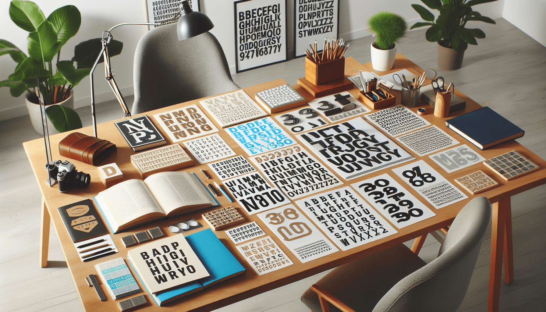
Typography is an art form that goes beyond simply choosing a font; it involves crafting an entire visual experience that conveys a message with clarity and style. Whether you’re designing a website, creating a printed document, or setting up a presentation, mastering typography is crucial. Here are some essential tips to elevate your typography skills.
1. The Art of Font Selection
Font selection is a foundational aspect of typography. Your choice of fonts can profoundly impact the tone and readability of your content. When selecting fonts, consider the context and the audience. Serif fonts, like Times New Roman, suggest tradition and reliability, making them ideal for formal documents. Sans-serif fonts, such as Arial, are perceived as modern and clean, fitting well with digital interfaces.
Avoid using too many fonts in a single piece. Limit yourself to two or three typefaces to maintain a harmonious design. You can create contrast and hierarchy by combining fonts with varying weights and styles from the same family.
2. Understanding Spacing
Proper spacing can transform text from chaotic to organized. This includes line spacing (leading), letter spacing (tracking), and the space between words. Each element affects readability and aesthetics.
Line spacing is crucial for readability. Too little space can make text difficult to read, while too much can create a sense of disconnection. A good rule of thumb is to set your leading to 1.25 to 1.5 times the font size.
Letter spacing should be adjusted based on the typography's style and medium. For example, increased tracking can add an elegant touch to capital letters, while decreased tracking can make body text more compact.
3. Alignment as a Design Tool
Alignment is another vital aspect of typography that influences readability and design harmony. Text can be aligned to the left, right, center, or justified. Each type of alignment has its own use cases.
Left alignment is the most common for left-to-right languages, offering a natural flow that is easy to follow. Center alignment can be useful for titles or headers but should be used sparingly in body text as it can make reading difficult. Right alignment might be used in niche instances, such as aligning numbers in a column. Justification can create a clean look for body text but requires careful spacing adjustments to avoid awkward gaps.
4. Creating Visual Hierarchy
A well-structured hierarchy guides the reader through content seamlessly. Typography plays a critical role in this. Use size, weight, and color to establish a visual flow. Headlines should be bold and prominent, subheadings should be distinct but smaller than headlines, and body text should be easy to read.
Contrast is essential in hierarchy. If everything is bold, nothing stands out. Use varying weights and sizes to differentiate levels of importance. Additionally, color can be a powerful tool to draw attention or differentiate text sections.
5. Consistency is Key
Consistency in typography enhances professionalism and brand recognition. Once you choose a style for your project, stick with it throughout. This includes keeping font families, sizes, colors, and spacing consistent. Developing a style guide can be helpful to ensure uniformity across various media and platforms.
In conclusion, mastering typography requires an understanding of several interconnected elements: from font selection and spacing to alignment and hierarchy. By carefully considering each of these components, you can create clean, effective, and visually appealing typography that enhances your overall design. As you hone your skills, remember that typography is not just about making text look good—it's about communication and enhancing user experience.